How to Sketch a Website: A Step-by-Step Guide
Building a website design from the ground up is already challenging, especially for first-timers. Website Layout Sketching is the first and most important step in the web design process. In this article, we will show you how to sketch a website in an efficient way by dividing the process into simple steps for creating web design ideas.
This guide has tips and insights from experts, as well as real-world examples to help even the least experienced folks start or improve their web design journey with ease.
Importance of Sketching a Website
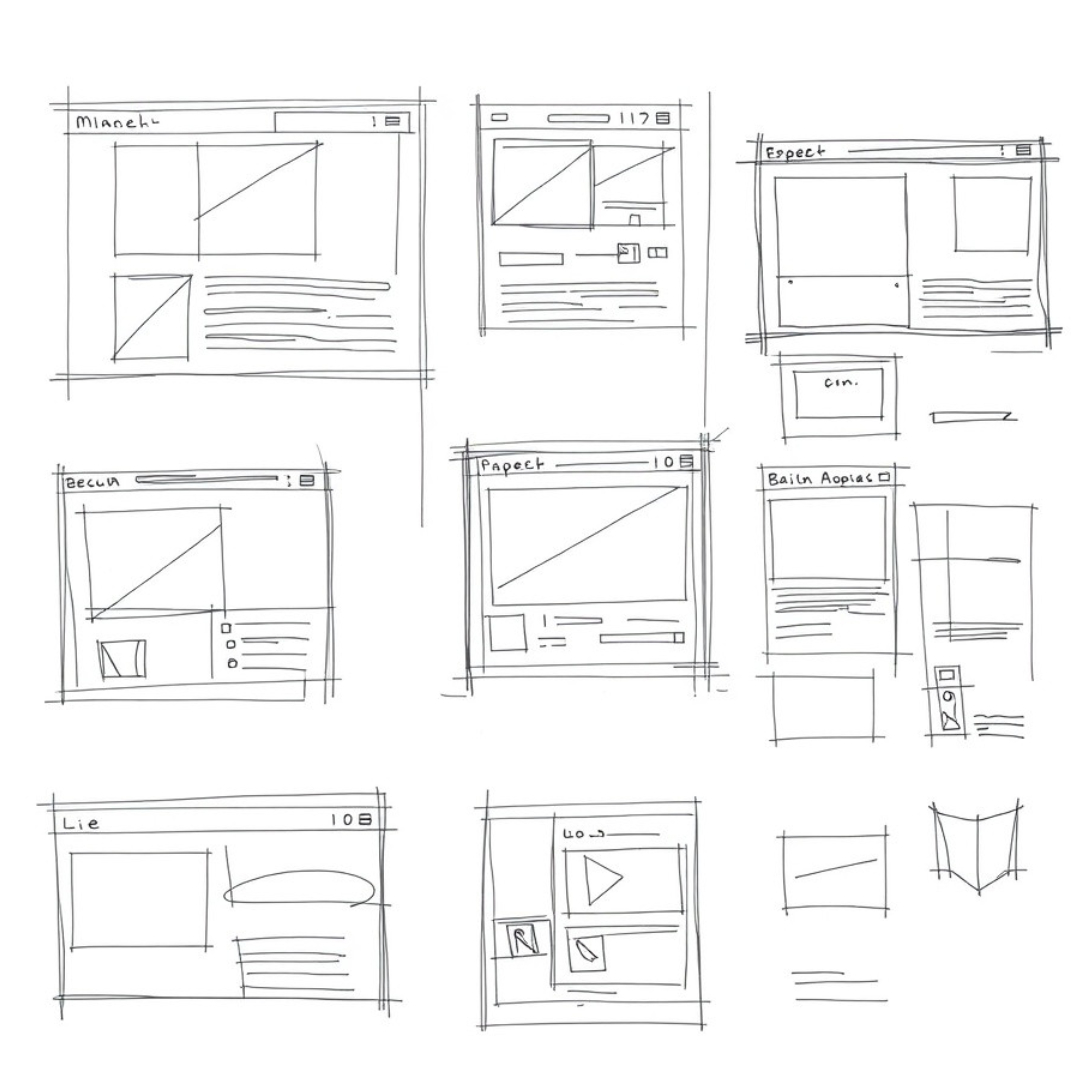
Drawing out a website before diving into more sophisticated tools or any code allows you to plan the layout, organization, and user flow without distractions. So, it’s time to sketch the website design.
That way you can concentrate purely on the visual hierarchy, where content will be placed, and how a user would interact with that web page. This type of step is what often separates a clear, easily comprehensible website from one that seems all over the place.
As a web designer sketch in general helps to have a clear concept of what information is needed there. Not only that but it is an awesome tool to iterate and decide on the design before you jump into Figma or Adobe XD which often takes a long time for each revision.
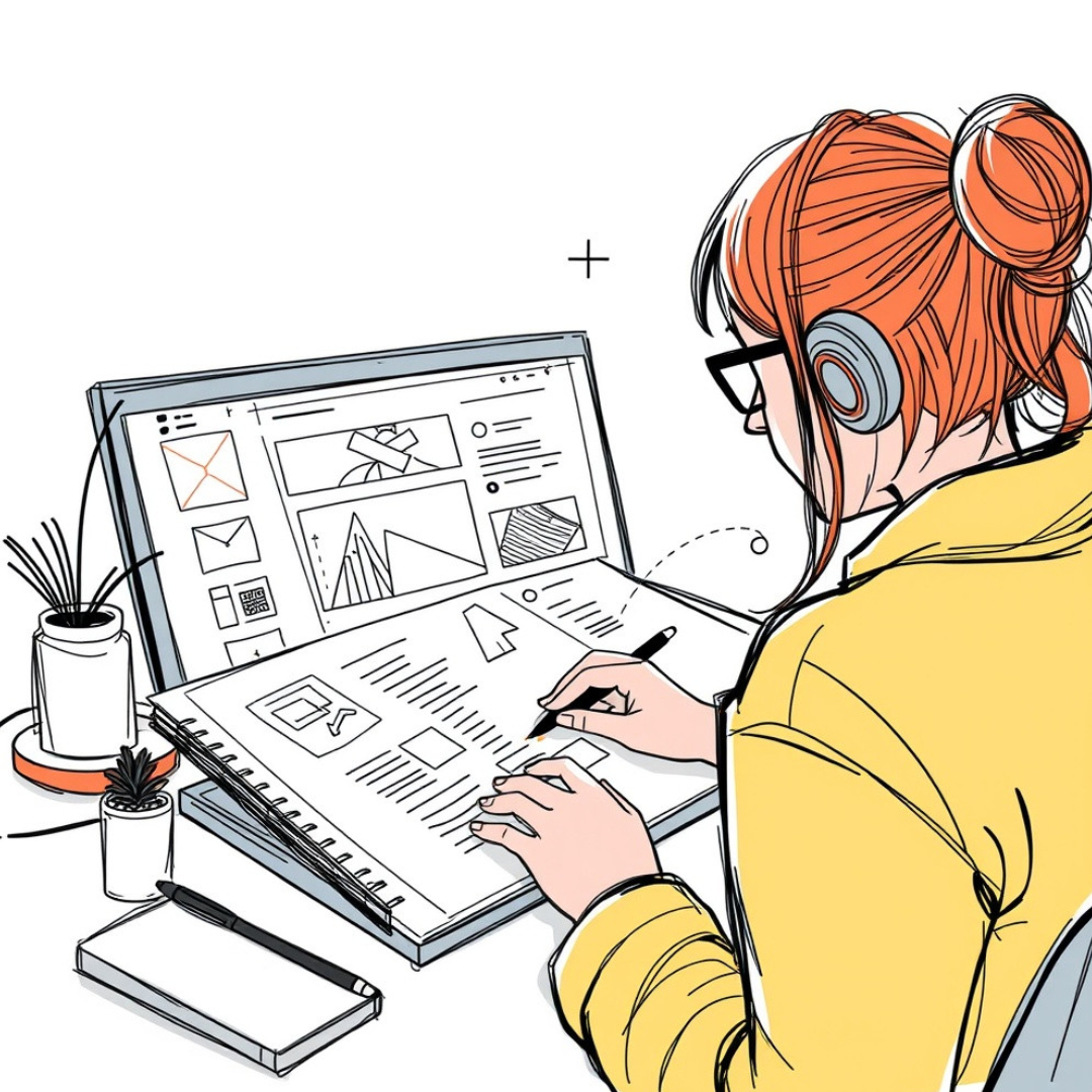
When you are still sketching with a pen and paper or using a basic design tool, it is easy to go back and make quick adjustments, and prototype around different ideas in low fidelity without too much cost.
We will learn why designing a website requires to be first sketched, and how the practice of drawing sketches before making any layout builds a strong base that helps in further design.
The Essentials Of Website Sketching
While you’re learning how to sketch a website, an appreciation for the parts of a webpage is essential. To get started In an elementary webpage, a layout usually contains such components as a header, footer side nav, and main. Together, these will be a subclass of the website. If you could position every element in a healthy way, it would greatly enhance your user experience (UX) to the next level when shifting to actual development.
Next time you are sketching a website interface, draft out the container in which our header will appear on top for example. After that would be the body, in other words everything you need to write and then a footer. Think about yourself moving from one section to the next. Do you have an important call-to-action (CTA) that needs to be seen?
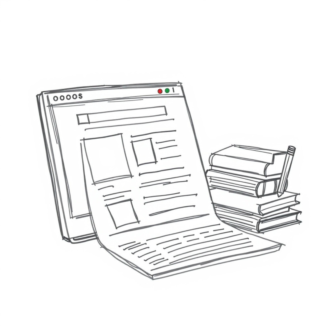
A web page sketch does not need to be perfect but it should convey the outline and content organization of your idea. This will be more of a function than fashion at this point. This effectively maps out your website so be clear in how you explain it.
Tools And Techniques to Sketch Your Site
While you may sketch a website by hand and with pencils, digital tools are heavily used. Digital sketches can be quickly modified, and it is easier to work digitally for detail adding. If you want to create digital website sketches, make use of software such as Adobe XD, Sketch, or Figma Drag and Drop components. This can help you a lot with web design.
But if you are new to this thing, I suggest starting with basic sketching tools or even something that is free like Balsamiq (there is probably better software), but it serves the purpose and its designed for wireframing/basic website sketches. They provide a more rule-based environment to website layout design drawing without being concerned about too many advanced features.
You might want to use Sketch web design tools which are more experienced with high-fidelity wireframes or even prototype designs. It can reduce the number of round trips and bring your design website in sketch format closer to reality while aligning it with a digital approach.
9 Steps to Sketch a Website
Define the Purpose and Goals
Defining the purpose and goal of sketching a website is where we should initiate our journey. All websites serve some purpose sell something, inform about something, show services. This step sets a base for the complete design process.
Consult with some stakeholders (external clients, internal team members or end users) to understand the main aim of this website. Defining the goals Increasing conversions, Volumizing brand goodwill or stimulating user engagement, ensure that the goal for your website adheres to overall business or personal objectives.
Research and Gather Inspiration
Research is an important part of developing any website sketch. In this way, it allows you to learn what trends in design and functional designs would strike a chord with your audience. This step includes getting inspiration from already running sites (inspecting the functionality and how it works)
Review competitor websites, sites in the same industry or other websites you admire. Discover design inspiration through platforms like Behance, Dribble and Awwwards as well. Notice how everything is laid out, what colours are used, the type of text and its size as well as interactivity. Observe what functionalities, navigation and features are successful in the kind of industry you work in.
The research phase will help guide your design decisions. One of the shortcuts available to you as a beginner is paying attention to what has been working and conversely not working, effectively avoiding some usual traps by being forced into learning from best practices.
Create a Content Inventory
A content inventory is a list that you prepare listing all the material that will appear on your website. A thorough inventory also helps you sort information and ensure that no important piece is overlooked when structuring your website.
Collect all content you will use such as text, images, videos, documents and downloadable assets. Categorize it (Ie: Homepage, About Us Text, Blog Articles, Product Descriptions). This will enable you to figure out what each page should include and how the content should be arranged.
A complete content inventory will help to find the missing content, have a uniform voice throughout the pages and avoid overpowering information in one place. This also guarantees that all relevant information is delivered flawlessly and suitable on the site.
Define User Flow
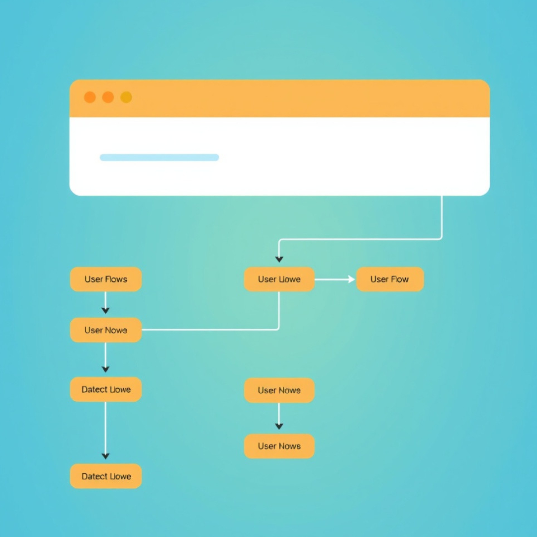
User flow is the path which a user goes to complete tasks on your website. It needs to be really well thought out so that the users can clearly get around and complete their goals without being left in a state of confusion or annoyance.
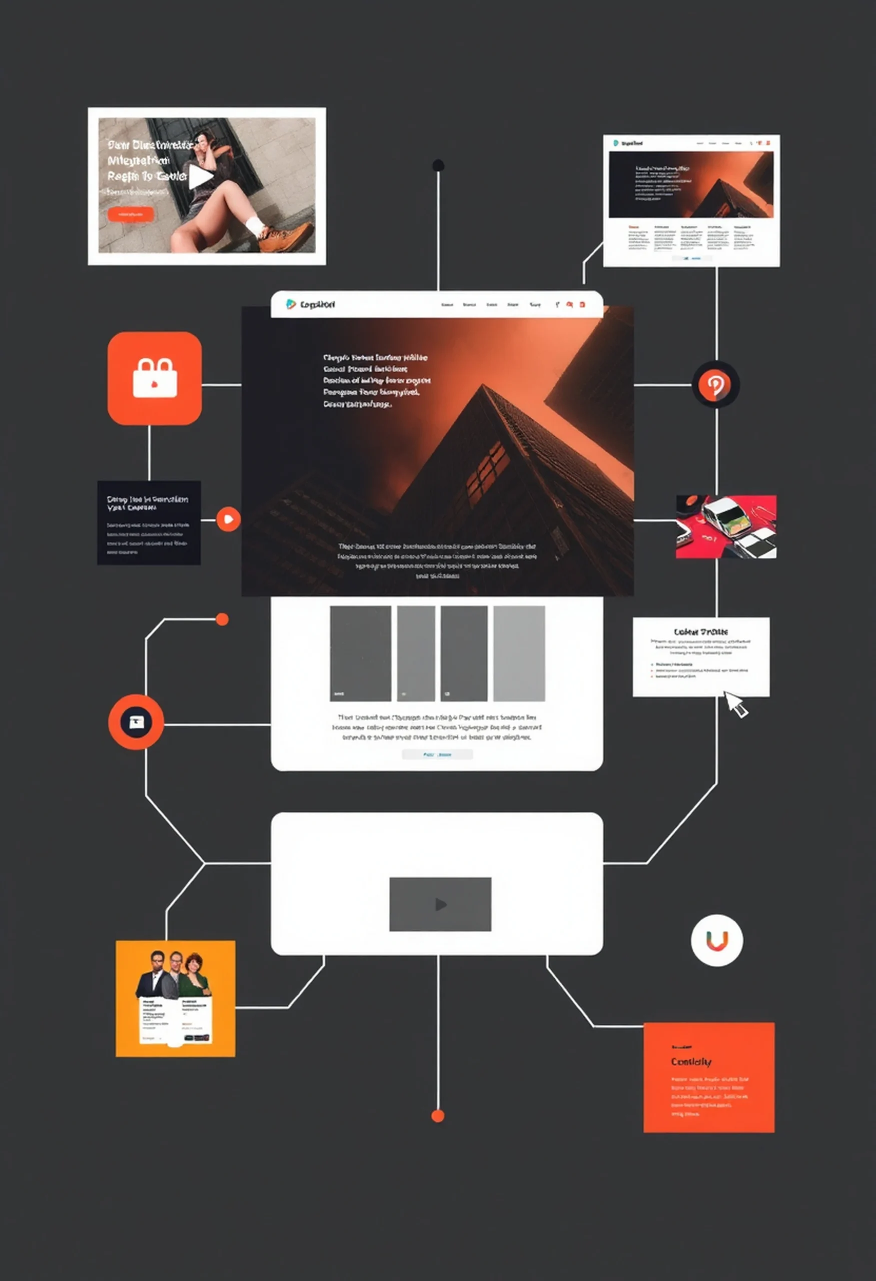
Map out what users do. So let’s say, for example; your website is an e-commerce site. The user flow would imply searching products>adding to cart > checking out. A visualization of the pathways a user would through visiting your homepage and on to interactions at critical points.
Having a clear user flow means that your site is easy to use. It removes the barriers to wayfinding, focuses users and increases conversion or goal completion (purchase, sign-up, inquiry).
Sketch Wireframes
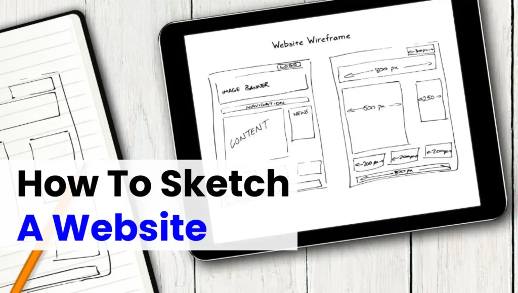
Wireframes are skeletal layouts of a website. These are essentially black-and-white, low-fidelity mockups that show the skeleton of what a site should contain and where it should go without any design elements like colors, fonts or imagery.
Outline the basic layout for key pages like Homepage, Product page and Contact Page. Define where the most significant elements like menu navigation, headers/footers and buttons would appear together with content blocks. These initial structures can be created wireframe tools such as Figma, Adobe XD or even on paper with a pen.
These wireframes provide an understanding of how the website is going to look and feature presentation like navigation, content in a more arranged way. It also serves as the reference for designing, there you can add your visual elements.
Plan Layout and Structure
Planning the layout is the logical step to be taken after wireframing. This stage is when developers & designers decide how the content/elements will be arranged and what they should look like so it matches with user flow as well as reaches website goals.
Look at incorporating grids and columns to organise the content aesthetically. Make your web pages responsive so that they look good on various devices(screen sizes) such as desktop, mobile and tablet etc. Take the example of a simple homepage layout which may feature a big hero image, short intro text about your services and followed by multiple CTA buttons. You will also set up the basic header and footer (since it´s something that almost always is available in each page).
Allows you to layout your page in a nice organized fashion, making the most use of it and evenly distributing elements throughout. It enhances the website’s usability and assists users in quickly finding what they are looking for or showcasing them where to go while leading them toward conversion points.
Pick colour scheme and Typography
Colors and Typography have a huge influence on the perception of your website by its users. Just like how an image evokes some emotions at the time we look at it and add to the aestheticism of your site.
Customization (choosing a color palette that is in line with the organization) In other words, use color psychology to stimulate certain emotions (blue evokes trust; red ignites energy). Use a primary font (for headlines) and a secondary font (for body text) to create the visual hierarchy.
It will show the proper colors, and typefaces that all make your brand message better come through while making sure everything looks readable/readable enough. When you always use the same colors and feats it will give a well-established vibe which makes to trust more easily.
Add Graphics and Images
Visual elements like images, icons, and graphics throughout your site help break up text making the content more digestible. In order to give this site a polished and professional look, the visuals need to be of very good quality.
Select pictures and drawings depicting the meaning of the website. Such as product images for an e-commerce site, or infographics on a service-based site. Vector icons for core actions (such as “add to cart”) or contact us and a few more are very useful. Ensure Images are Optimized to Load Faster.
The site looks better and appeals more to the user because of its visuals. Images and graphics provide an attractive ambience as well as assist the user in navigating through content. They also help to develop the storytelling of a website, increasing engagement.
Test and Revise
After creating the wireframes, architecture and visual treatments you need to make sure that everything works properly. Before the website is developed, this phase helps you identify and resolve any shortcomings.
Test the product without adding any new features and gather insight into how they are navigating through your current design phase. Make sure that it works well on different devices (desktop/tablet/mobile). Measure page load speed, click into this test and try different links for functionality (does the button work).
A trial and error process will guarantee the website serves correctly what it’s supposed to do. This ensures a streamlined transition from design to launch as well as helps catch and resolve potential issues before moving ahead with development.
So, the following detailed steps provide a complete routine of how you can sketch website starting from an idea to brainstorming and finishing with testing your sketches. An accumulation of each step leads to a well-organized, intuitive and targeted website.
Importance of Website Layout Design Drawing
This is the stage where you begin to flesh out a design sketch. At this point, you can start to sketch the different parts of content, visual, and click objects such as buttons or images.
A good website sketch will tell you where your headlines are going, where images or videos should be located, and how much space around buttons/links. In this step, attention should be paid to user experience (UX) as users need a website that they can use swiftly and effortlessly. Consider how a user will engage with different sections, whether they must scroll or click on things, or interact with special buttons.
This is important not so much from the perspective of aesthetics as from design-sketch practicality distributed otherwise to keep your layout balanced. A structure that is chaotic or inconsistent may Render users unable to access reach content and diminish their engagement with the virtual reality environment.
Importance of Adding Color and Style to Website Sketch
Designing a website is the step in this process where you get to design how your site will look visually. Be sure to add color, typography, and any design elements that can make your sketch come out of the paper more elaborately closer to a real final representation.
This step is crucial, but do not worry about having a polished design. Even add some filler colors or styles just to get an idea of what the various elements will look like. The right things headers, CTAs, and other important areas to interact
Design sketch tools that give you color palettes and easy preview of typography also help a lot. It sounds cliché, but this is a spectacular opportunity to test different elements in your brand visual identity colors, font sizes, and family fonts or spacing. However, don’t forget that the simplicity of design makes an experience easy to read.
Website Sketches Testing Guide
Testing is one of the most important steps in website sketching. Testing the website sketches with stakeholders or potential users to get feedback before moving forward on the details of the design. At this point, receiving feedback is important because it is easier to adjust a sketch than sit down and rewrite code on your complete website.
Walkthrough with someone to complete tasks at the layout will test your sketches. Can they easily locate the information that they seek? Does the design make sense? If so, how easily are you pressing it? All these questions are things you can work with to sharpen your design further before taking the plunge into high-fidelity prototypes.
Although in my experience it may be neglected, testing website sketches is crucial to help avoid expensive errors in the long term.
In conclusion
In a nutshell, sketching one´s website is not all about doodling around; it can also be seen as an exercise of problem-solving and visualization for user flows. If done correctly to organize content smartly. Following the tips in this blog will help you to understand how to design a web and make it user-friendly, as well as visually appealing.
Don’t worry too much about getting it perfect from the start if you’re a beginner. Beginning with the first drafts and onwards The more you practice, the easier it will be for your ideas to translate into great website designs.
FAQ
How to create a sketch of a website?
Start by drawing the basic structure of your website on paper or using a digital tool. Include sections like the navigation bar, header, content blocks, sidebar, and footer. Use placeholders for text, images, and buttons to represent content.
How do you graphic design a website?
Graphic design for a website involves creating visually appealing layouts using tools like Figma, Adobe XD, or Canva. Focus on typography, color schemes, images, and user experience while maintaining consistency across pages.
What is the best sketching website?
Some of the best tools for website sketching include Figma, Sketch, Adobe XD, and Balsamiq. These tools allow you to create wireframes and prototypes with ease, offering drag-and-drop features and collaboration options.
How do I design a website layout?
To design a website layout, start by understanding your target audience and purpose. Create a wireframe that includes key elements like navigation, header, main content, and footer. Then, add visual elements like colors, fonts, and images to enhance the user experience.
Can I design a website myself?
Yes, you can design a website yourself using website builders like Wix, Squarespace, or WordPress. These platforms provide templates and drag-and-drop editors, making it easy to create a professional-looking site without coding experience.




1 thought on “How to Sketch a Website (9 Easy Steps)”
It is rather valuable piece