

What is the Hero Section of a Website?
The hero section is one of the most important elements on a website that can determine the website’s outcome in web development projects. There are some essential elements of hero section. What is a hero section of a website, and why do you need one?
The hero section is the first thing your visitors see and establishes the tone for the rest of your site, regardless of whether you’re developing a personal portfolio, an e-commerce platform, or any other type of corporate site.
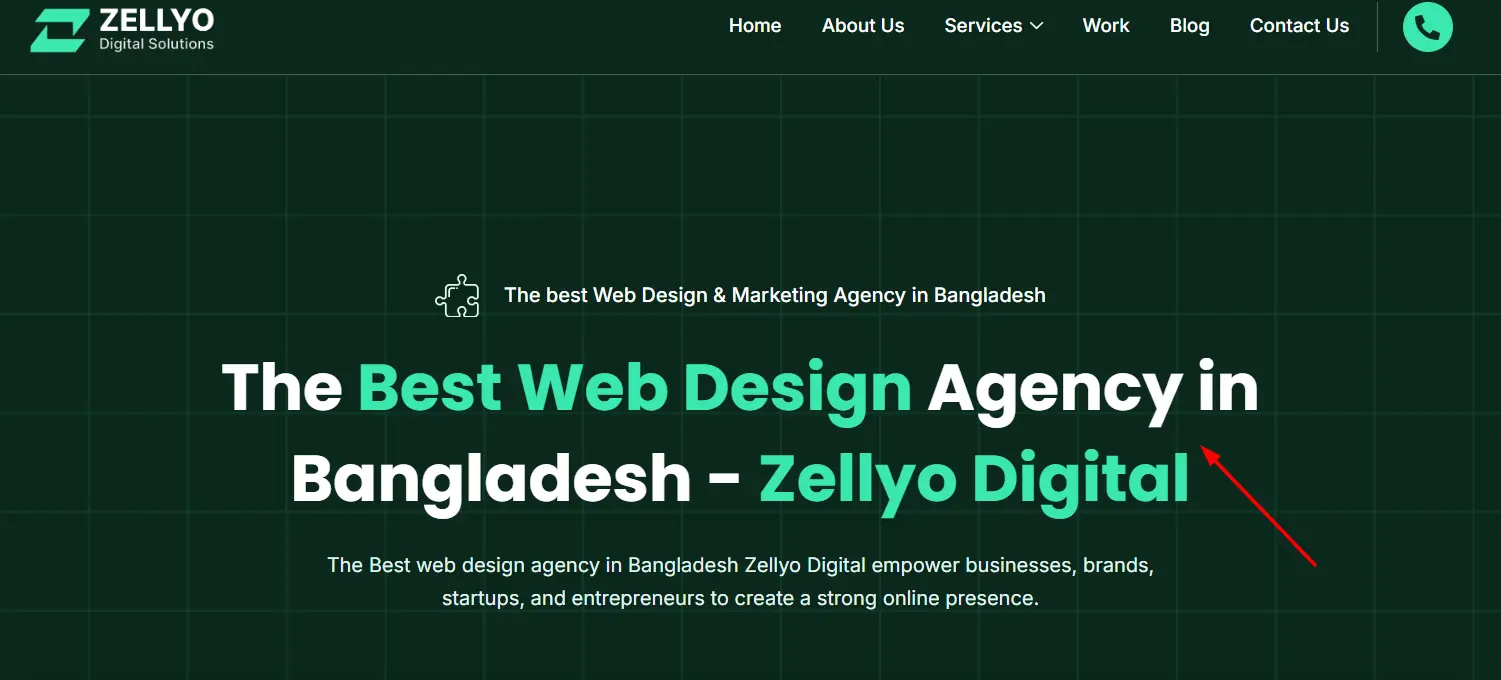
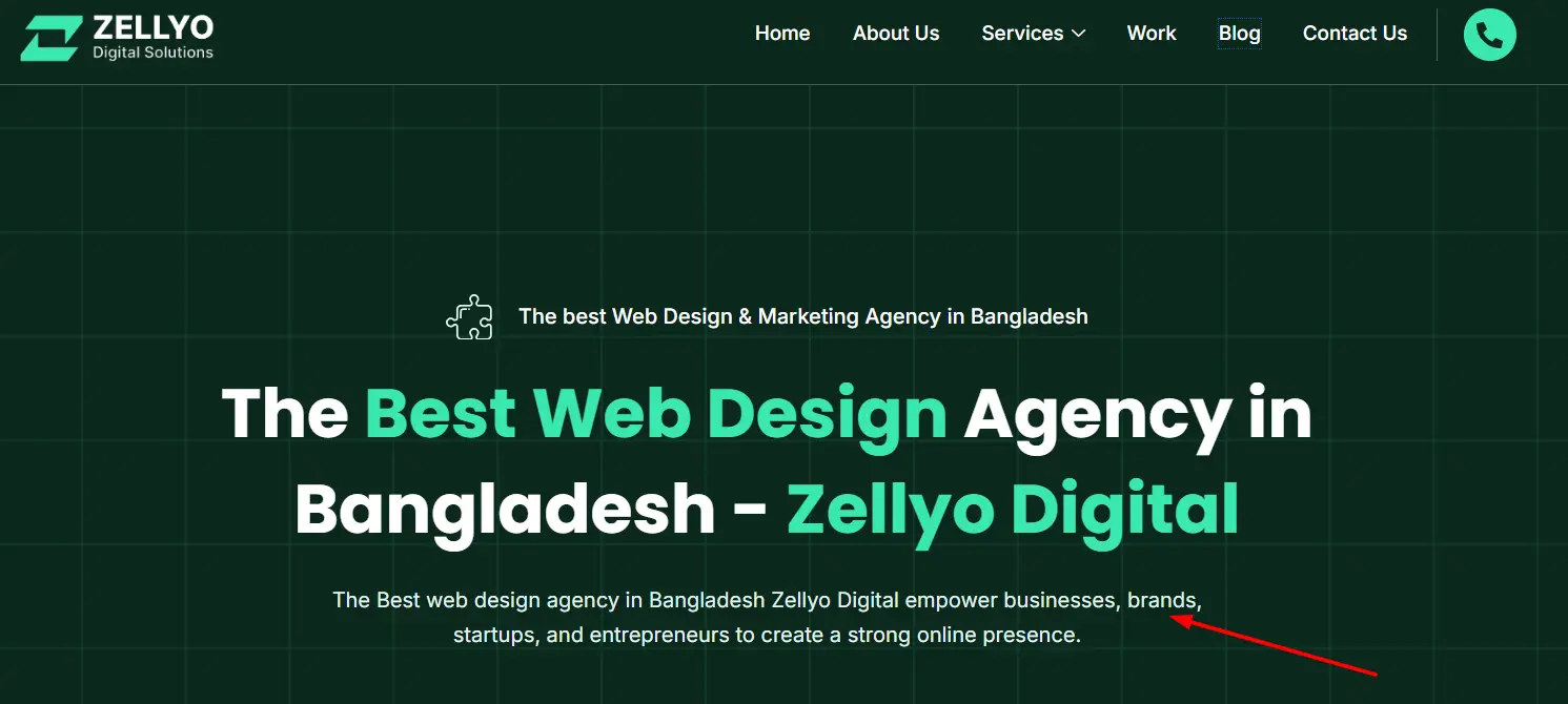
A hero section is one of the first things users see when they visit your website. It’s a large zone with prominent positioning, generally at the very top of a webpage, and includes important items like a headline, subheadline, CTA, and sometimes a video or image background. Its aim is to capture the visitor’s eye and communicate the site’s primary value proposition in an interesting, visually appealing fashion.
In this blog, I will guide you about the hero section, best practices for designing it, and real-world examples that demonstrate its success. Having worked in web development for over 8 years, I know how crucial it is to use the correct hero section for the effectiveness of website conversion.
How It Works Website Sections?
I didn’t realize how impactful the hero section can be on the user experience and conversions when I first started in web development. As I learned more, I realized that a website’s hero is its digital handshake. It’s the point at which a user will decide whether or not they’ll stick around.
Visitors should understand in a hero section what this site is about and what action they should take next. Keep the text simple and direct, with a visually appealing but simplistic design. If the hero is too crowded, users get confused and leave. If you have an e-commerce website, for example, your hero section should highlight an important product or a special offer with an attractive CTA, such as “Shop Now.”
Hero sections also include an introduction to the website. They set the branding of the site and determine the design tone of the whole experience. The key components when it comes to making a great first impression are high-quality images, good typography, and elements of white space. One of the most significant aspects of your site that stands between whether a user will stay or close the page within seconds is the hero section.
Essential Elements of Hero Section
There are 10 essential elements of hero section that should work together to deliver an engaging, functional and attractive experience. These elements include:
| Element | Description |
|---|---|
| Headline | A clear, attention-grabbing statement. |
| Subheadline | A brief supporting sentence with more context. |
| Call to Action (CTA) | A button or link prompting user action (e.g., “Get Started”). |
| Background Image/Video | Visual content supporting the website’s message. |
| Social Proof | Testimonials or logos that build trust and credibility. |
| Navigation | Links to guide users to other important parts of the site. |
| Value Proposition | A statement explaining why users should stay or take action. |
| Supporting Visuals | Additional graphics or illustrations that enhance the message. |
| Contact Information | Contact details for easy access. |
| Mobile Optimization | Ensures the section looks great on all devices. |
Breif Description about Essential Elements of Hero Section
Headline
The headline is the visitors’ very first point of contact and should work as a hook to capture their attention. It must be short, clear, and engaging, usually highlighting the primary benefit or value proposition that the website provides. The headline is a common and purposeful way for the user’s needs to be directly answered. So, a SaaS app could use the headline “Simplify Your Workflow with Our Tool,” instantly showing users how they stand to benefit immediately. The headline should be in large readable text in contrast to the background, easily visible.
Subheadline
The purpose of the subheadline is to reinforce it by including additional details to capture the user. The subheadline is a great opportunity to offer further explanations about what the user will be getting or how the product or service functions. Here’s an example, “Our tool integrates with your existing software to automate repetitive tasks, saving you time.” A subheadline that enhances the headline but is not too long or complicated.
Call to Action (CTA)
The call to action (CTA) is, in fact, the most crucial part of a hero section because it directs the user to the next step. It’s usually a big, colorful button or link with action-driven text, like “Get Started,” “Sign Up Now,” or “Learn More.” CTA must be distinct from the remaining content using contrasting colors, clear wording, and a strategic position typically beneath the headline and subheadline. The CTA text must say something urgent/valuable (like “Claim Your Free Trial Today”).
Background Image or Video
An effective way to make an emotional connection with visitors is to use a background image or video in the hero section. It is expected to be aesthetic, brand relevant and well-produced. A good background visual should complement the message, showing the product in action or inducing an emotion that aligns with the brand’s mission. A fitness brand, for instance, may use a video of people exercising with their apparatus, whereas a luxury brand might go with a classy, sophisticated image. As the graphic should not distract from the text, it is often either dimmed or slightly blurred to keep the text at the forefront.
Social Proof
Some examples of social proof are customer testimonials, reviews, case studies, industry awards, and logos of trusted brands and partners. It helps create trust among the new users by letting them know that many others have already used the service or product, and they have gained benefits from that. A software company, for instance, might display logos of well-known companies that use its product or a few short customer testimonials highlighting its features. Social proof helps to reassure visitors that they’re making the correct decision, particularly if the site is promoting a brand-new service or product.
Navigation
Navigation helps the user to go deeper into the website. It normally contains links to important sections, such as “About Us,” “Products,” “Blog,” or “Contact.” The hero section usually has a horizontal menu or a sticky navigation bar that stays visible as users scroll. The nav should be intuitive, as any usability improvement will make it more user-friendly, providing access to sections in one click. So, it is also important for the menu to be mobile-friendly by adapting it to different mobile screen sizes without losing its functionality.
Value Proposition
The value proposition is the answer to the fundamental question: “Why should I stay here or do something now?” This is a short statement or phrase that appears just below the headline, which highlights the main benefit or unique proposition of the product, service or website. For example, a cloud storage business might have a value proposition such as “Store your files from anywhere, anytime, with no limits.” Keep it Lean: You want to make the value proposition either very small or find the business value for addressing the user issue.
Supporting Visuals
Icons, illustrations or any other images complement the communication of the message and contribute to the user experience. For instance, an e-commerce site may have product photos, or a service featuring icons showing key features or benefits. These images should be integrated with the style of the site and should complement the content without taking over. Text alone can make this section tedious so adding supporting visuals can help break down the text and contribute to it being more engaging or visually pleasing.
Contact Information
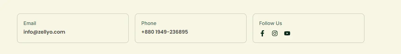
Depending on the type of website, contact info in the hero section will be helpful. This could be a phone number, email address or a “Contact Us” button. For service-based businesses like law firms and consultant services, ease of access to contact information can help build trust and improve conversions. This is particularly useful for users who are in a position to ask questions or book a consultation immediately.
Mobile Optimization

As the number of users accessing websites through mobile devices is also increasing, optimizing the hero section for mobiles is equally important. This means making sure the text is readable, the buttons are tappable, the images are scaled properly, and the layout is responsive at smaller sizes, all without losing functionality or design fidelity.
For instance, on mobile, the hero section could consist of a simplified nav menu, cohesive text alignment, and larger CTAs for easy clicking. Mobile optimization means that regardless of the device, your users have a good experience.
These are essential elements of hero section contributing elements toward building a well-designed and user-centered hero area. Combined carefully, they can create a strong first impression and encourage users to take the desired actions on the website.
Hero Section Design — Things to Keep in Mind
Because of its prominence, a hero section web is a design chapter that necessitates aesthetic-functional balance. As a web developer, I’ve developed a couple of best practices that can help clients design a hero section that not only looks good but converts visitors into leads or customers.
First, keep it simple. A cluttered design or white space drowning in the text can confuse visitors. The only clear message in the “hero” section should be the one that is easily understandable within seconds. A headline and subheadline that describe what the website will offer and why it’s worth the visitor’s time.
Secondly, focus your call to action (CTA). The CTA must be eye-catching and clear and make the audience take action right away. Whether it reads “Get Started,” “Buy Now,” or “Learn More,” the CTA needs to direct the user on their next steps. Put it above the fold (the portion of the page visible without scrolling) and make it big enough to catch people’s eyes.
Finally, optimize for mobile. With mobile traffic on the rise, it’s important that the hero section looks great and works well on every device. This translates into responsive or fluid design, meaning elements resize and scale well so that text is readable, logo images are clear, and buttons can be clicked.
In my experience, most clients do well with a mobile-optimized hero section. It helps them collect leads and conversions on smaller screen sizes when users are on the go, making the site more accessible and moving.
How To Design Hero Section?
Now, to demonstrate how these best practices can be applied in the real world, let’s take a look at a successful hero section design. A software company that sells project management tools was one of my clients; they needed a clean and eye-catching hero section that communicated the product’s main benefit: saving time.
The headline: “Simplify Your Team’s Workflow,” immediately addressed the pain point of busy project managers. Under the headline, the subheadline explained: “Organize tasks, collaborate, and automate in one place.” This gave a little more context without going overboard.The CTA was an orange button with the text “Start Your Free Trial,” inviting users to sample the product immediately.
This design led to an uptick in conversions and user engagement for the site. This clear, compelling hero section built trust, conveyed the offer’s value and nudged the user to the next action.
Common Mistakes to Avoid in Designing Hero Section Of Website
However, when it comes to creating a hero-designed website, you should steer clear of some common mistakes that will chase users away rather than engage them. The first mistake I’ve experienced so many times throughout the years is not using your hero section efficiently and using too much text.
It’s easy to want to write down every feature or benefit, but too much text can drown out the visitor. Be brave, get the important message across and keep it simple.
Another typical error is neglecting the mobile experience. Given that over half of all web traffic is on mobile devices, ensuring that the hero section is fully responsive is vital. If not, you risk a frustrating user experience which often results in lost conversions.
Last but not the least, watch out for speed loading. When your website is slow, there will be higher bounce rates, because heavier images or videos slow down your website. A website that loads slow will frustrate visitors straight away and make them leave before even seeing the hero section. Be sure to optimize all media files, and test the page load time; you want to ensure the absolute best experience for your users.
Why the Hero Section matters for the conversions on the website
The hero section of a website is critically important, and one of the main reasons is that it influences conversions. The purpose of any website is to lead visitors to do something, be it to sign up, buy something, or get in touch with you for more information. This process begins at the hero section
The hero section is usually the first thing a visitor gets to touch, and it establishes the tone for all that comes after. An effective hero section can drive people into trust, brand the website, and tell the user what to do next. This is precisely why its worth spending time to get your hero section right for your website.
For instance, a hero section might be used for an e-commerce store to promote a sale or special offer, with a CTA to shop now. For example, a SaaS company offers a free trial with a powerful CTA that uses the hero to encourage users to sign up right away.
Conclusion
Ultimately, the hero section is an integral part of web design. It’s the first thing that visitors see and an important part of tone setting, trust building, and directing users to take action. Whether you are creating a hero section of the web for an online store, for your personal portfolio or corporate page, make sure that it is clean and minimalistic with a distinct value that it represents and essential elements of hero section should remain.
By using best practices, avoiding common mistakes, and optimizing for mobile, you can produce a hero section that not only looks good but also induces conversions. With over 8 years of experience in web development, I have witnessed how a well-designed hero section can change the game for a website and increase user engagement. If you are setting up a website then you should put the hero section on your list as it will be one of the major factors for your website.
FAQ
What should a hero section include?
A hero section should include a clear headline, supporting text, a call-to-action button, and relevant visuals like images or videos. The design should be clean and focused on guiding the user’s attention.
What are the essential components of a hero?
The essential components are a headline, supporting text, a call-to-action button, and visuals. The background should be simple to enhance readability.
What is the hero section component?
The hero section component is a design block at the top of a webpage that includes text, visuals, and CTAs, aimed at grabbing attention and encouraging user interaction.
What is the anatomy of the hero section?
The anatomy includes a headline, supporting text, a call-to-action button, and visuals, with a simple background to maintain focus on the message.
How to create a hero section?
To create a hero section, start with a strong headline, add supporting text, and include a call-to-action button. Use engaging visuals and ensure the layout is clean and responsive.